Designing the desktop experience that shut down Scripbox's legacy website
What started as a reporting portal for assisted clients became the platform behind Scripbox's entire user base, designed from scratch and scaled to every user.
Context
Scripbox is one of India's biggest wealth management platforms, with ₹21,000 Cr+ in assets under management.
I owned design end to end, from strategy to delivery. I defined the experience and interaction direction across reporting, information architecture and the invest flow, partnering closely with product and engineering to shape what the platform should become. I now lead design across the app, managing a team of two designers.
- Sushma Bhandari (Me)Lead Designer
- Sanoop MenonProduct Designer
- Medha SethProduct Manager
6 Months
Scripbox grew by acquiring wealth management firms across India.
- Each firm ran its own systems
- Each RM worked differently with clients
- No unified product for all acquired clients


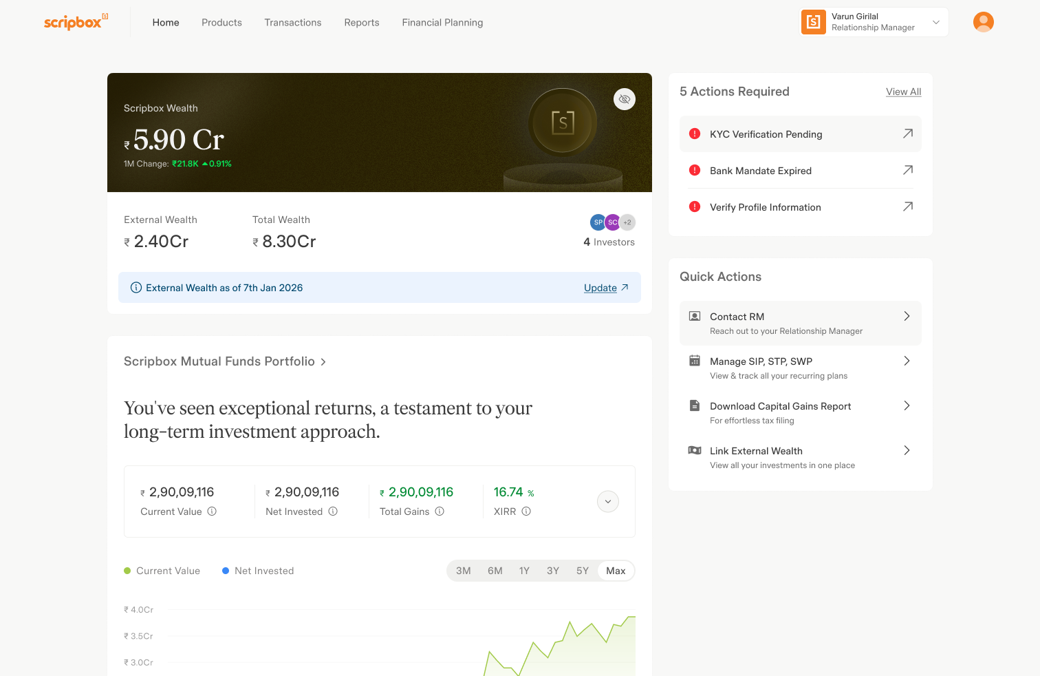
The client portal became the one platform all assisted clients would use.
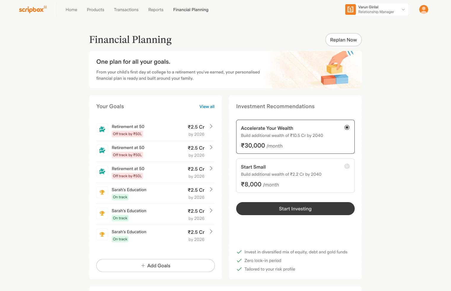
A single experience for assisted clients, built for viewing and reporting only. Since RMs handled transactions on their behalf, the portal never needed to.
Performance reporting
Every month, a Relationship Manager (RM) would get on a call with the assisted clients and help them understand their portfolio through a PDF performance report.
The portfolio report contains
- Overall wealth A single view of everything the client owned across mutual funds, PMS, bonds, and stocks.
- Long-term growth How the portfolio's value moved over eight years.
- Downside protection How the portfolio held up against the index during a market downturn.
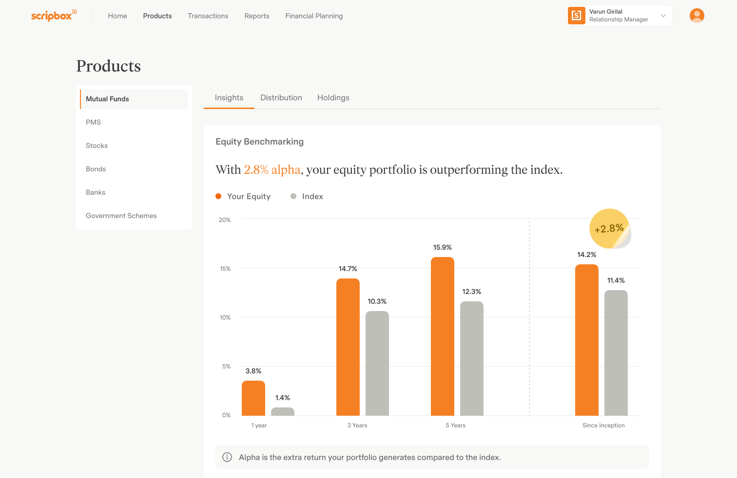
- Benchmarking How the equity portfolio performed relative to the index.
- Rebalancing A recommended set of changes to reduce fund overlap and simplify the portfolio.
But none of it lived on the Client Portal,
which led to:
No access without an RM. Performance data lived with someone else, to see it, you had to ask.
Updated once a month. Whatever changed in between was invisible until the next report.
Just a page. Nothing to click, filter, or dig into.
The PDF report had nearly 20 types of reporting. What should make it to the Client Portal?
With the help of the RMs, we narrowed down on what to keep and what wasn't required on the platform.
The next challenge was deciding how to organise different types of reporting.
Our existing navigation wasn't built for this level of complexity.
We designed a navigation system that could grow with the product.
Products competed for space in the top navigation.
Every Mutual Fund insight lived on one scrolling page.
New reporting meant adding more content, not improving structure.
Product navigation moved to the sidebar.
Nested tabs grouped information by purpose.
Reporting became modular, discoverable and easier to scale.
The upgraded client portal raised a bigger question.
The new reporting experience highlighted an imbalance in our desktop products.
Why should the better desktop experience
be limited to just 10% of users?
Scripbox decided to bring the client portal to everyone.
Redesigning the invest flow
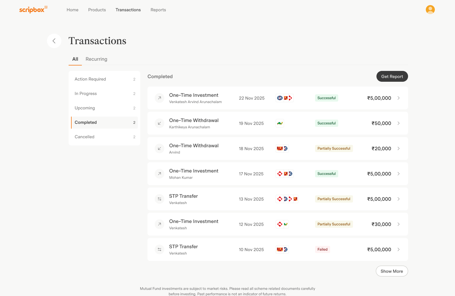
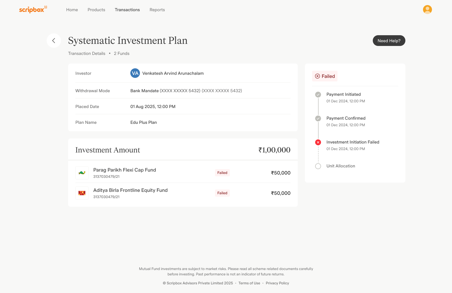
Opening the portal to everyone meant closing a gap first: transactions.
Assisted clients never needed to transact themselves. Their RM did it for them. But a portal for everyone meant the portal itself had to handle it.
75%+ of users dropped off at the first step of the old invest flow.
It couldn't be ported over as it was. It needed multiple UX improvements first.
- Too many decisions in a single step Investment type, amount, schedule, step-up, and fund selection were all packed into a single screen, increasing cognitive load.
- Primary CTA below the fold Users had to scroll before reaching the primary action, delaying progression through the flow.
- Hidden fund customization The option to customize recommended funds was buried below the fold, making it easy to miss.
- No sense of progression The journey lacked a clear structure, making it difficult for users to understand where they were and what came next.
- Weak visual hierarchy Primary actions, secondary actions, and supporting information competed for attention instead of guiding users through the experience.
We redesigned the invest flow around four key principles.
- One decision at a time The investment journey was broken into four focused steps, allowing users to make one decision at a time instead of navigating a long, overwhelming form.
- Clear sense of progress A progress indicator provided visibility into where users were in the journey and what remained, helping set expectations throughout the flow.
- Consistent primary actions A sticky primary CTA remained visible across every step, while page-level and in-step actions were clearly differentiated to create predictable interaction patterns.
- Stronger information hierarchy Primary tasks were prioritized, while supporting information like summaries and projections was positioned contextually, helping users focus on the right decision at the right time.
Impact
How we transformed the desktop experience
A monthly PDF became live reporting inside the portal.
Two platforms became one. The legacy website with limited functionality was shut down.
Redesigned around the failure points behind a 75%+ drop-off at the first step.
Scripbox × Parallel
The partnership grew
Parallel went from designing one surface to leading design across Scripbox's client portal, app, and marketing. App case study is coming soon.